Question – Nothing to Hide
As technology makes surveillance of many kinds ever easier, some people are worried about Big Brother, two words which conveniently encompass the general idea that this would be bad, via Orwell’s 1984, which incidentally is one of those classics that you really should read if you haven’t yet as it is only becoming more relevant.
In response to this, others say “If you have nothing to hide, then you have nothing to fear,” which is powerfully concise rebuttal to these vague fears.
I can think of some counterarguments to that, but they tend to be long, and as noted by The Brads, something that takes more than 140 characters to explain doesn’t generally spread. So: this week’s challenge is to come up with a counterargument for “nothing to hide” that is 140 characters long or fewer.
Link
A while ago, as an experiment, Jonathan Stark made his Starbucks card details public, so anyone could add credit and anyone could spend that credit. His page explaining this is here. (Note the caveat at the top – this no longer works).
Sam Odio found an easy way to transfer credit to his own Starbucks card, and I recommend reading his take on the idea (and his exploit) here.
If you don’t have time for that, you could just read this summary of the whole story over at Good, which lays out the whole strange tale.
Quote
Les Dawson:
“There is a remote tribe that worships the number zero. Is nothing sacred?”
Picture (via Jason)
Pure internet linkbait, but with an execution this good, it deserves to be: Dr Who cats.
Previous Puzzle
Last time I asked for ways to visualise data in such a way that mix shifts affecting conversion rate would be readily apparent.
Adam naturally had a full consultant’s answer, explaining how he would show the data different ways depending on the audience (sales director, website content manager, SEO manager…), and how he might talk through the component parts of the change in a sequence of slides, which is all very sensible. However, what I really want is something that I as an analyst can look at to apprehend the whole situation, ideally in a generic way, so any given shift becomes clear.
Simon described an interesting single-view answer, but in preparing this post I realised I needed to confirm some of its details with him, so that will have to wait for a later edition of Things.
On to my answer… the data set was as follows:
[before mix shift | after mix shift]:
Banjo section visits [10,000 | 20,000] – lots more traffic
Banjo section sales [100 | 220]
Banjo section conversion [1.0% | 1.1%] – conversion increases!
Gun section visits [1,000 | 1,000] – same traffic as ever
Gun section sales [100 | 110]
Gun section conversion [10% | 11%] – conversion increases!
Overall conversion before:
(100 + 100) / (10,000 + 1,000) = 1.82%
Overall conversion after:
(220 + 110) / (20,000 + 1,000) = 1.57% – overall conversion has decreased!
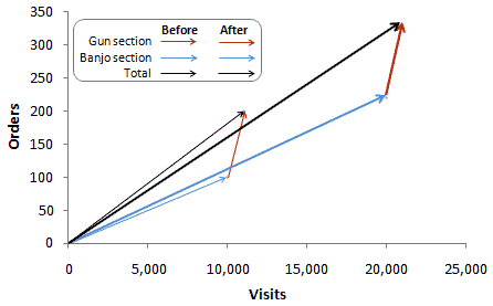
My solution looks like this:

This shows how the total visits and orders (black lines) are composed of the individual sections (red/gun and blue/banjo). While both the blue and red arrows get steeper (representing improved conversion, although it’s hard to see this on the red arrow), the angle of the black line decreases (representing the overall decrease in conversion), since the blue arrow became so much longer.
This pretty much works for the extreme example given. However, it has significant weaknesses as a general solution:
- It doesn’t work as a trended view – conceivably it could be animated, but that seems like overkill
- It’s hard to compare the angle of arrows when traffic changes significantly, as in the gun section above
- It tends to encode all the interesting information into a narrow diagonal band of the chart.
Further improvements are of course welcome!
-Transmission Ends

