Categories
New

Things 112: Eyes, Guessing Cat, Amigara Fault

This week Things has a very slight Hallowe’en theme.

Puzzle
This is one where you should gather some people around the monitor and see who can do best: guess the cartoon (or CG) character from their eyes (mouse over the eyes to see the character outline that should tell you if you’re right).

And yes, it is pretty difficult – I only got 6, and I watch a lot of animation!

Video
Here’s a video that begs the question: is the cat playing the game, or just acting out of blind instinct?

http://www.youtube.com/watch?v=QrlTijuhVOA

To which the answer is to have a big argument about the definitions being used before concluding that you can’t tell.

Quote
In the wonderfully stylised animation The Secret of Kells, I heard the line “One beetle recognises another” and wondered if it was some kind of proverb. It turns out that it is, and actually – obviously – there are a whole bunch of Irish Proverbs, which in translated form become alternately profound, banal or hilarious, just as I imagine English proverbs must seem if you haven’t grown up with them. Here’s a list of them on Wikiquote, and here are a few of my favourites, for unstated reasons:

“Every beginning is weak.”

“Time is a good story teller.”

“A lamb becomes a sheep with distance…”

“The quiet are guilty”

Comic
The Enigma of Amigara Fault is a horror comic that impressed me with its unconventional approach. It’s 32 pages, and originally in Japanese so you have to read the panels right to left. But if you want a comic that will freak you out for Hallowe’en, it’s worth it. Unless you’re particularly claustrophobic, in which case you should probably steer clear of it entirely.

Answer – Malady X
In Things 111 I asked what the probability of having Malady X is if a randomly administered 99%-accurate test for it comes back positive. As Phil and Thomas noted, you can’t actually answer from this information alone: you also have to know what the probability of a random person actually having Malady X is. A lot of people don’t have an intuition for this fact. I’m going to attempt to explain ways to apprehend that hand-wavingly, mathematically, and visually.

Argument from hand waving and examples:
Imagine the probability of having Malady X is 0% – nobody has it. In this case, it’s certain that getting a positive result means you were simply in the 1% of cases where the test comes back incorrect.
Conversely if the probability of having it is 100% – everybody has it – then you must be in the 99% of cases where it is accurate. In this way, it’s clear the underlying probability influences the chances that the test is correct!

We might worry that these extremes somehow break the puzzle, so let’s imagine less extreme alternatives. Imagine 1,000 people are tested. If 50% (500) really have Malady X, on average we expect the test to come back positive for 99% of them (495) and also for 1% of the 500 that don’t have it (5). In this situation, 495 out of the 500 people for whom the test was positive actually have the disease – 99%.

Alternatively, if 1 person (or 0.1%) out of the 1,000 has the disease, they’re very likely to be correctly diagnosed, and we expect roughly 10 of the other 999 to get a positive result. In this case 1 out of 11 people with a positive result actually have Malady X – fewer than 10%. So clearly the underlying incidence level matters.

Argument from maths:
There are two probabilities at work: the chance the test is correct (99%) and the chance of anyone having Malady X (unknown – let’s call it X%). When you combine probabilities you multiply them, so for example the chance of anyone actually having Malady X AND getting a postive result is 99% times X%.

If someone gets a positive result and that’s all we know, we reason as follows:
A = Probability someone has Malady X and tests positive = X% times 99% times
B = Probability someone does not have Malady X but still tests positive = (100% – X%) times 1%
If you test positive, the chance you actually have it is C = A / (A+B). But if you haven’t studied probability carefully, I’m not sure you could infer this, which is why I like to come up with other ways of getting a feel for the correct answer.

Argument from visualisation:
Since there are two probabilities in question, and we combine probabilities by multiplying, this naturally suggests a visualisation where probability is represented by rectangular area (since area is calculated by multiplying height by breadth).

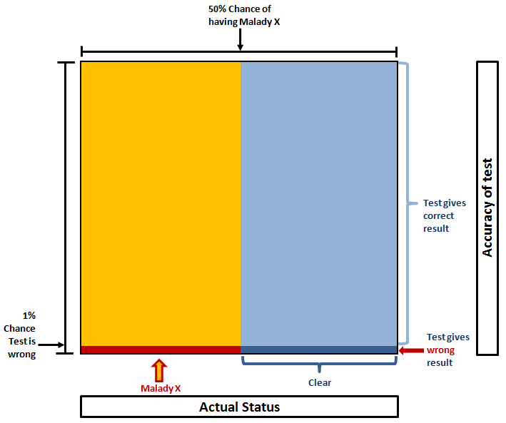
For example, if we imagine the actual incidence rate of Malady X is 50%, the picture would look like this (click for big):

If the test result is positive, you either have it and the result is correct (big yellow area) or you don’t have it but the test was incorrect (small dark blue area). The chance of you actually having Malady X is equal to the proportion of those combined areas that is yellow. In this case:
Yellow = 99% x 50% = 49.5%
Dark blue = 1% * 50% = 0.5%
Probability you have it = Proportion that is yellow = 49.5% / (49.5% + 0.5%) = 99%.

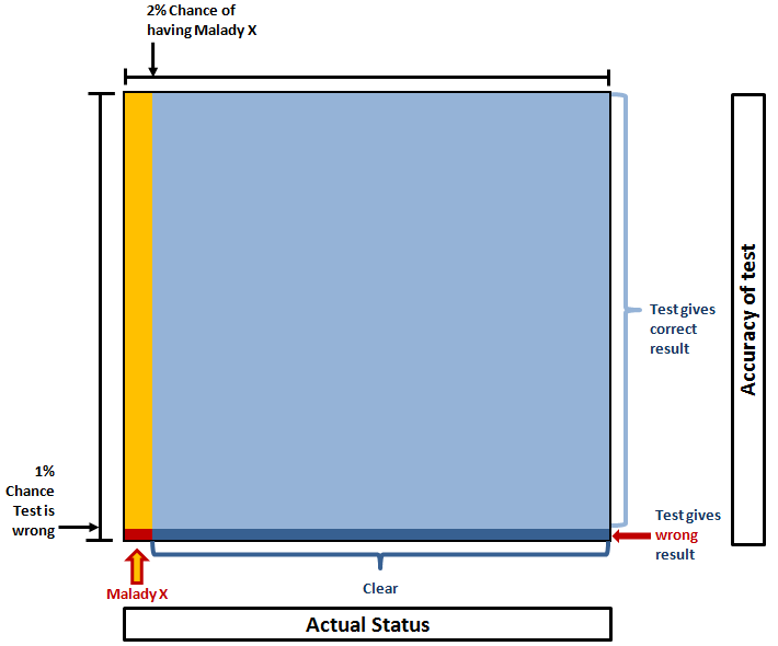
Alternatively if the incidence rate is, say, 2%, it looks like this:

Here we see the yellow and dark blue areas are very similar, so the chance of you being one or the other is much more even. In fact, it’s:
Yellow = 99% x 2% = 1.98%
Dark blue = 1% x 98% = 0.98%
Probability you have it = Proportion that is yellow = 1.98% / (1.98% + 0.98%) = 67% (ish).

As Peter Donnelly shows in this TED talk, this actually has some severe ramifications, because when the probability of the thing being tested for is extremely low, it becomes overwhelmingly likely that a positive result is false, but people intuitively feel that a 99% accurate test should be correct 99% of the time.

Thomas also noted:

If anyone is interested in playing around with the probabilities (even if you’re not familiar with the maths), I recommend GeNIe:
http://genie.sis.pitt.edu/
It lets you create networks of dependencies, set evidence and work out probabilities in problems just like these.

-Transmission finally ends
Categories
New

Things 111: Malady X, Stretching Cat, 3 Panels

Question
(Thanks to Simon for reminding me of this important probability lesson!)

At random, you are tested for Malady X. Alarmingly (particularly given that you don’t even know what Malady X is) the test comes back positive. But you know these tests are not always perfect – there’s a chance that it’s wrong, and you don’t really have Malady X at all. So you ask how accurate the test is. You are told that if someone really does have Malady X, there’s a 99% chance the test will come back positive; for someone that doesn’t have it, there is a 99% chance the test will come back negative.

What is the probability that you actually have Malady X?

Animated Gif
Here is the best animated gif of a cat I have seen in a long time:

Link
(via Silv3r): A huge and (I think?) growing collection of street fliers that play with the form, some okay and others quite, quite brilliant, can be found here (browse the other pages if you like what you see).

Picture
I am proud to be able to say that I know James White, the author of this perfect 3-panel comic, personally.

Answer
Last time I asked about what people really mean when they claim “change is accelerating”.

The most direct and plausible answer came from John B, who suggested that the scope of human knowledge is the thing that is really growing, and the subjective change we experience is what arises from these discoveries. While it’s only a proxy, one way to measure this is to track how many patents are granted over time, and on a logarithmic scale this does look kind of linear (indicating acceleration).

Bex has an alternative view. The perception of change seems to generally accelerate with age (which in itself is already enough to explain why people claim this all the time). The population of the UK (at least) is ageing. Therefore, the speed-of-change will be reported to be, on average, faster over time. Sneaky!

As the Wikipedia article on the subject currently notes, another confounding factor could be the growth of the human race itself. For example, if a fixed proportion of humans files patents, exponential growth in human race will directly lead to exponential growth in patents filed.

In any field, taking any trend and extrapolating it arbitrarily far into the future is generally unwise. If we don’t know exactly what we’re measuring, and we don’t understand the factors governing the change, even less so. Given the potential disruptions of the technology we’re seeing already, if anything it seems just as likely to me that sudden power imbalances become more likely, which could lead to large swathes of humanity being wiped out, or global human society turning into a dead-end all-powerful dictatorship with no desire to change the status quo.

Categories
New

Things 110: Tom Cookie Monster Waits, Base Jumping with Dan Deacon, Nothing To Hide

Question – is change accelerating?
I’ve had vague qualms about the rhetoric of accelerating change, but intuitively felt that even if the arguments weren’t quite right, there was still some truth in it. Matt Edgar confronts these arguments directly here, noting among other things that Moore’s law is hardly a useful measure of change as experienced by humans, that the human perspective tends to see the present as faster-moving than the past, and that by some important measures, change has actually reduced:

There is one factor that is radically different today from any other time in history, and that is the size of the Earth’s human population […] one might argue that the global population boom is only made possible by stability in whole swathes of the world previously troubled by uncertainty and disruptive change.

So this week’s question: when we say “the pace of change is accelerating”, what exactly do we mean by that, and how can that be proved?

Video
Another example of a cracking concept combined with an excellent execution (provided you’re already passingly familiar with the work of Tom Waits and the Cookie Monster):


Link

The extraordinary API-linking service that acts like internet duct-tape, If This Then That (which I mentioned back in July when talking about how I find things on the internet) has now properly launched. They explain it pretty well on this aptly named page. One of the hardest things to do with IFTTT is work out what you should do with it, so rather brilliantly you can now see a list of the most popular tasks. (Personally I use it to cross-post my webcomic to Tumblr, email myself a reminder to do various things at the end of the month, and to add Twitter favourites to Read It Later).


Another video
That was technically a link I have shared earlier, so here’s something else: a rather nice video of people base jumping in some particularly ridiculous ways. However, the soundtrack gives the impression that they are striving to achieve something important for all of humanity, when in fact it’s pure, senseless, wonderful frivolity. As such, I recommend using a Dan Deacon soundtrack, which I conveniently provide for you below to play at the same time. (Dan Deacon is not to everyone’s taste though, so feel free to substitute your own flavour of insanely optimistic music).

For those that haven’t done this before: hit play and pause on both videos to get them streaming. Turn down the volume on the base jumpers to zero. Then when you’ve got enough streaming going on, hit play on both, and fullscreen the base jumpers.

Note that in terms of content, both videos take about a minute to kick off properly, so if you’re impatient then jump to ~50s into each one first.

http://www.youtube.com/watch?v=vFlBJ1xZK10

There. Much better!


Quote

Very surprised I never came across this one from John Adams before:

“It is more important that innocence be protected than it is that guilt be punished, for guilt and crimes are so frequent in this world that they cannot all be punished. But if innocence itself is brought to the bar and condemned, perhaps to die, then the citizen will say, “whether I do good or whether I do evil is immaterial, for innocence itself is no protection,” and if such an idea as that were to take hold in the mind of the citizen that would be the end of security whatsoever.”

Rather satisfyingly (in a TV Tropes kind of way) this general idea is filed under Blackstone’s Formulation.


Last Week’s Question – Nothing to Hide?
Last week I asked for tweetable responses to the argument, “If you have nothing to hide then you have nothing to fear”, and got an impressive range of responses.

Xuan somewhat flippantly shot back:

“I have nothing to hide but a lot to lose so piss off Big Brother”

Simon says “nothing to hide” is wrong because it

“…presupposes that the reason someone desire[s] privacy is to conceal a wrong. What if people want privacy for other reasons?”

This is similar to my own thinking, which is essentially that privacy as a notion is a counterargument in itself. Hence my own answers along the lines of:

“If you have nothing to hide, why do you have curtains?”

“If you have nothing to hide, you’re not representative of the majority”

Richard pointed out that at the peak of the Wikileaks hubbub, this tweet did the rounds:

“Dear government: as you keep telling us, if you’ve done nothing wrong, you’ve got nothing to fear #wikileaks”

On a similar note, Rik points out that this is a good time to quote Juvenal:

“Who watches the watchmen?”

This neatly digs out the hidden assumption of “nothing to hide”, which is that the people you might hide something from can themselves be relied upon to act on that information “correctly” (whatever that may mean). However, this argument is a double-edged sword. The strongest reading (as I see it) is that the very idea of watchmen hides a kind of Gödelian paradox (after all, who would watch the people watching the watchmen?). But if you interpret it more simply it suggests that the answer to bad surveillance is good surveillance.

Or put another way: it seems to suggest that problems with surveillance can be solved by adding more surveillance. Given that surveillance already has that feedback loop baked-in (if crimes take place out of sight of CCTV then naturally you solve this by having more CCTV), this counterargument might not actually help.

A more direct line of attack might be to use extreme examples of Watchmen we may not feel comfortable about, for which I suggest:

“In Orwell’s 1984, should Winston Smith have anything to fear from Big Brother?”

“Would you still have nothing to hide if an extremist party formed part of the ruling coalition?”

Finally, Adam has a different approach:

“Given enough information I can make anyone look guilty”

An idea we’ve seen in various political and journalistic thrillers is that everyone has something that you could expose to damage their reputation, but Adam’s argument takes this a step further. This also confronts the above mentioned feedback loop of increasing surveillance head-on. As Adam says:

As […] data on each person grows, so too does the scope for misuse, misinterpretion and misidentity. […] No individual fact could be incorrect, but they could be formed into a picture that is, as it is known that people look for facts that meet their beliefs, and with enough information this could be achieved an alarmingly high proportion of the time…

That’s my favourite answer so far, although it does need people to buy into some form of Blackstone’s formulation (see above John Adams quote). This will be an argument to refer back to over the coming years I suspect.

There’s much more to say on this, but that will have to wait for another blog post.

Categories
New

Things 109: Jonathan’s Card, Dr Who Cats, Mix Shift Visualisation

Question – Nothing to Hide
As technology makes surveillance of many kinds ever easier, some people  are worried about Big Brother, two words which conveniently encompass the general idea that this would be bad, via Orwell’s 1984, which incidentally is one of those classics that you really should read if you haven’t yet as it is only becoming more relevant.

In response to this, others say “If you have nothing to hide, then you have nothing to fear,” which is powerfully concise rebuttal to these vague fears.

I can think of some counterarguments to that, but they tend to be long, and as noted by The Brads, something that takes more than 140 characters to explain doesn’t generally spread. So: this week’s challenge is to come up with a counterargument for “nothing to hide” that is 140 characters long or fewer.

Link
A while ago, as an experiment, Jonathan Stark made his Starbucks card details public, so anyone could add credit and anyone could spend that credit. His page explaining this is here. (Note the caveat at the top – this no longer works).

Sam Odio found an easy way to transfer credit to his own Starbucks card, and I recommend reading his take on the idea (and his exploit) here.

If you don’t have time for that, you could just read this summary of the whole story over at Good, which lays out the whole strange tale.

Quote
Les Dawson:

“There is a remote tribe that worships the number zero. Is nothing sacred?”

Picture (via Jason)
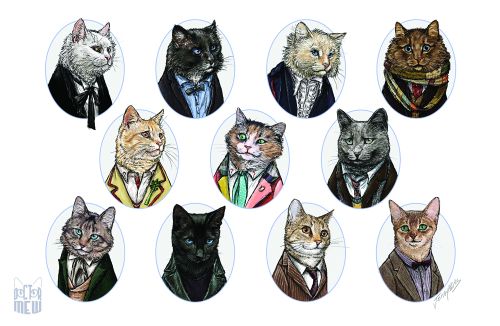
Pure internet linkbait, but with an execution this good, it deserves to be: Dr Who cats.

Previous Puzzle
Last time I asked for ways to visualise data in such a way that mix shifts affecting conversion rate would be readily apparent.

Adam naturally had a full consultant’s answer, explaining how he would show the data different ways depending on the audience (sales director, website content manager, SEO manager…), and how he might talk through the component parts of the change in a sequence of slides, which is all very sensible. However, what I really want is something that I as an analyst can look at to apprehend the whole situation, ideally in a generic way, so any given shift becomes clear.

Simon described an interesting single-view answer, but in preparing this post I realised I needed to confirm some of its details with him, so that will have to wait for a later edition of Things.

On to my answer… the data set was as follows:

[before mix shift | after mix shift]:

Banjo section visits [10,000 | 20,000] – lots more traffic
Banjo section sales [100 | 220]
Banjo section conversion [1.0% | 1.1%] – conversion increases!

Gun section visits [1,000 | 1,000] – same traffic as ever
Gun section sales [100 | 110]
Gun section conversion [10% | 11%] – conversion increases!

Overall conversion before:
(100 + 100) / (10,000 + 1,000) = 1.82%
Overall conversion after:
(220 + 110) / (20,000 + 1,000) = 1.57% – overall conversion has decreased!

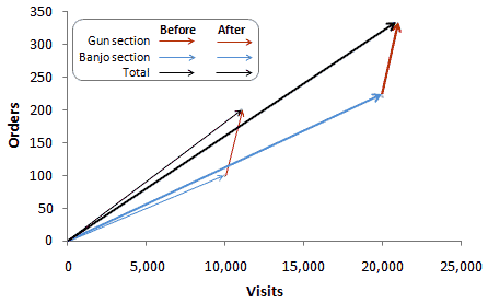
My solution looks like this:

This shows how the total visits and orders (black lines) are composed of the individual sections (red/gun and blue/banjo). While both the blue and red arrows get steeper (representing improved conversion, although it’s hard to see this on the red arrow), the angle of the black line decreases (representing the overall decrease in conversion), since the blue arrow became so much longer.

This pretty much works for the extreme example given. However, it has significant weaknesses as a general solution:

  • It doesn’t work as a trended view – conceivably it could be animated, but that seems like overkill
  • It’s hard to compare the angle of arrows when traffic changes significantly, as in the gun section above
  • It tends to encode all the interesting information into a narrow diagonal band of the chart.

Further improvements are of course welcome!

-Transmission Ends