Categories
Old

Things 59: Building Projection, Plant Sculpture, and the Train Problem

(Originally sent October 2009)

Films
I saw Surrogates, which was a strong enough concept (with relevance to the kind of changes we will see in the coming decades, even if we don’t quite achieve fully robotic avatars affordable by 98% of the population) that it maintained interest despite the weak writing and characters.

Video
Technology unlocks surprising things. Witness the kind of trompe l’oeil magic that can now be achieved by virtue of having a powerful enough digital projector:

If you like that, there’s more here.

Link
Highlighted in the final part of last week’s issue of The Week, this article from pseudonymous postman Roy Mayall casts an interesting light on the current wrangling with Royal Mail.

Key quote from towards the end:

“There is a tension between the Royal Mail as a profit-making business and the Royal Mail as a public service. For most of the Royal Mail management … it is the first. To the delivery officer … it is more than likely the second.”

The current ongoing (in)action would seem to stem directly from this tension.

Pictures
Sculpture/carpentry/architecture with living plants.

I suspect this would seem less benign if the same modificiations to a natural form could be carried out within minutes instead of over the course of years.

Puzzle
I mentioned this puzzle in a recent discussion stemming from Things and it sparked a lot of interest. Here is a version only slightly modified from the way I originally heard it from Laurence:

Trains leaving station A only go to station B. A single from A to B costs £3. A return from A to B and back again costs £5. A woman walks into train station A for the first time in her life. She goes up to the counter and hands the cashier £5. Without either of them saying a word she is given a return ticket and leaves happy. How did the cashier know what she wanted?

The original version, along with many other puzzles, can be found here:

http://www.mannveille.com/tim/mirror/stripper-puzzles.html

(Note that I think this puzzle should now be filed in the first section).

Before you are tempted to ask someone for help with this puzzle, please see this warning / subtle hint.

-Transmission Ends
Categories
New

Things 109: Jonathan’s Card, Dr Who Cats, Mix Shift Visualisation

Question – Nothing to Hide
As technology makes surveillance of many kinds ever easier, some people  are worried about Big Brother, two words which conveniently encompass the general idea that this would be bad, via Orwell’s 1984, which incidentally is one of those classics that you really should read if you haven’t yet as it is only becoming more relevant.

In response to this, others say “If you have nothing to hide, then you have nothing to fear,” which is powerfully concise rebuttal to these vague fears.

I can think of some counterarguments to that, but they tend to be long, and as noted by The Brads, something that takes more than 140 characters to explain doesn’t generally spread. So: this week’s challenge is to come up with a counterargument for “nothing to hide” that is 140 characters long or fewer.

Link
A while ago, as an experiment, Jonathan Stark made his Starbucks card details public, so anyone could add credit and anyone could spend that credit. His page explaining this is here. (Note the caveat at the top – this no longer works).

Sam Odio found an easy way to transfer credit to his own Starbucks card, and I recommend reading his take on the idea (and his exploit) here.

If you don’t have time for that, you could just read this summary of the whole story over at Good, which lays out the whole strange tale.

Quote
Les Dawson:

“There is a remote tribe that worships the number zero. Is nothing sacred?”

Picture (via Jason)
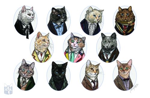
Pure internet linkbait, but with an execution this good, it deserves to be: Dr Who cats.

Previous Puzzle
Last time I asked for ways to visualise data in such a way that mix shifts affecting conversion rate would be readily apparent.

Adam naturally had a full consultant’s answer, explaining how he would show the data different ways depending on the audience (sales director, website content manager, SEO manager…), and how he might talk through the component parts of the change in a sequence of slides, which is all very sensible. However, what I really want is something that I as an analyst can look at to apprehend the whole situation, ideally in a generic way, so any given shift becomes clear.

Simon described an interesting single-view answer, but in preparing this post I realised I needed to confirm some of its details with him, so that will have to wait for a later edition of Things.

On to my answer… the data set was as follows:

[before mix shift | after mix shift]:

Banjo section visits [10,000 | 20,000] – lots more traffic
Banjo section sales [100 | 220]
Banjo section conversion [1.0% | 1.1%] – conversion increases!

Gun section visits [1,000 | 1,000] – same traffic as ever
Gun section sales [100 | 110]
Gun section conversion [10% | 11%] – conversion increases!

Overall conversion before:
(100 + 100) / (10,000 + 1,000) = 1.82%
Overall conversion after:
(220 + 110) / (20,000 + 1,000) = 1.57% – overall conversion has decreased!

My solution looks like this:

This shows how the total visits and orders (black lines) are composed of the individual sections (red/gun and blue/banjo). While both the blue and red arrows get steeper (representing improved conversion, although it’s hard to see this on the red arrow), the angle of the black line decreases (representing the overall decrease in conversion), since the blue arrow became so much longer.

This pretty much works for the extreme example given. However, it has significant weaknesses as a general solution:

  • It doesn’t work as a trended view – conceivably it could be animated, but that seems like overkill
  • It’s hard to compare the angle of arrows when traffic changes significantly, as in the gun section above
  • It tends to encode all the interesting information into a narrow diagonal band of the chart.

Further improvements are of course welcome!

-Transmission Ends

Categories
New

Things 108: Mix Shifts, Skrekkogle, 109 Children vs Real Madrid

Previous Puzzle: Guns & Banjos
Previously in Things I asked how a banjo and gun website could see conversion in its individual sections improving, but overall conversion decline. Xuan pointed out that visits to some part of the site not counted in either section could see an increase in non-converting visits and so drive the effect, but this is a loophole – even without such a section, the problem can still arise.

The answer here lies in the part of the data not revealed in the setting: the underlying traffic trends. In particular, if you have one particular section (or segment) that converts at a low rate, and the mix of your traffic shifts towards that group, then that will tend to pull down the overall average conversion, even if conversion within the groups is going up.

To take a simple example, consider the following figures for this theoretical guns and banjos site, with figures in the form [before mix shift | after mix shift]:

Banjo section visits [10,000 | 20,000] – lots more traffic
Banjo section sales [100 | 220]
Banjo section conversion [1.0% | 1.1%] – conversion increases!

Gun section visits [1,000 | 1,000] – same traffic as ever
Gun section sales [100 | 110]
Gun section conversion [10% | 11%] – conversion increases!

Overall conversion before:
(100 + 100) / (10,000 + 1,000) = 1.82%
Overall conversion after:
(220 + 110) / (20,000 + 1,000) = 1.57% – overall conversion has decreased!

In practice you will rarely see an effect this strong. On the other hand, you could well see mix shifts drive a significant part of an overall shift in conversion rate. So watch out for that.

Puzzle: Mix Shift Visualisation
This is a really tough one, but I know the Things recipients are up to the task.

Given that mix shifts as described above can be difficult to spot, how might you visualise your website’s data in such a way that any such effects became obvious?

(I have an answer for this, but I feel sure a better answer must exist).

Quote
Everyone seems to be linking to this surprisingly weakly curated collection of Steve Jobs quotes. One part that I did like expressed something I’ve been thinking for a while:

Steve Jobs: I have a very optimistic view of individuals. As individuals, people are inherently good. I have a somewhat more pessimistic view of people in groups.

Or as I’ve tried to distill it: humans don’t scale.

Link
These guys make cool stuff, even if their website is slightly too clever for its own good.

Video
It’s too easy for imagination to be constrained by what we already know exists. That’s why I like things like this video, which help remind us that many more things are possible. It’s not particularly well edited and there are no particular highlights, so feel free to skip through and enjoy the general sensation of weirdness, which is after all what we generally look for on the internet, and indeed in life. Or maybe that’s just me.

Categories
Special

Things 58: Video Special

(Originally sent September 2009)

I’ve built up a backlog of interesting videos I think are worth sharing, so it’s time for a Video Special. Whenever someone links me to a video I always have two questions I want to know before committing to a click – how long is it, and do I need sound – so I include this information after each link. [In the blog version videos are embedded so you can see the run time; I’ll just note if you need sound – T.M. 7th August 2011]

Everything is amazing, nobody is happy
Standup Louis C. K. gets some great mileage out of how the incredible speed of technological change is still exceeded by the human capacity to adapt to and take for granted new concepts (sound is all you need):

Mad Skills
“A man who taught himself rock climbing and acrobatics to escape poverty in India” – most amazing climbing move features at 30s (no sound needed):

http://www.youtube.com/watch?v=BPN3gLVDsOY


The idea mill
Assuming I saw the same trigger video, this is the fastest turnaround from an individual’s creative work going viral to the same idea being used in an ad I’ve ever seen (sound optional for all of these):

9th April 2009: “Wolf vs Pig”, using a kind of meta-Stop Motion:

2nd July 2009, 84 days later: same concept used in an ad for the Olympus PEN:

A bit later (as it doesn’t seem to have been officially uploaded), the same thing again, this time for Land Rover:


Simplicity
I find this kind of video reassuring – a simple concept and attention to detail in the execution, rather than incredible extravagance, can still produce a really nice result (sound essential):

Teaser trailer
Christopher Nolan (Memento, Dark Knight) has a new film coming out next year. I think this is my favourite teaser trailer ever, for conveying just an atmosphere and a single fun idea (sound not essential but awesome):