Categories
New

Things July 2015: Royalty Redistribution, Live Train Data, Future Cameras and Robot Art

Fairer Royalties, Better Music

I’m very interested in how the internet is changing the music industry. Some things are better (from some viewpoints): it’s cheaper to make music and distribute it; it’s easier to find and listen to a wider range of music. Some things might be worse, but it’s hard to tell: has the average amount of revenue made per song, or per minute of music, gone down? What about for the most popular 10 artists? What about for the median artist by income? Are there fewer full-time musicians, or more?

I’ve not seen good data on that, but this piece in The Economist is suggestive at least: the average age of festival headliners has gone up by 10 years over the past 20 years. But it’s not clear if that’s just because demand (for festivals) has gone up, and supply (of festival-pleasing artists) has risen more slowly, driven by older artists whose audiences now find festivals cater to their needs.

Over on PopJustice (which has my favourite cookie warning message), they suggest the move by Apple to streaming is the final nail in the coffin for not just paid downloads, but a thriving new music industry in general. If this seems hyperbolic, bear in mind that music buying doubtless follows a Pareto curve, and the small cohort that account for most of the music-buying have the strongest (short-term) incentive to switch to streaming.

With all this going on, it’s interesting to take a look at royalty distribution on streaming services. Superficially it seems simple and perfectly fair: they collect subscription fees and ad revenue, and then distribute them to artists based on how often their tracks have been played. This is how it works on Spotify.

But as this thoughtful article points out, that’s not necessarily the fairest. It would be fairer to directly distribute the revenue from a particular customer to the artists that customer listened to. That doesn’t sound like much of a change, but it really is, so I do recommend reading the article to see why. The author also argues that such a situation would be better for everyone, even the labels, and as such should be adopted. I’m less convinced by that. It’s true ‘on average’, but I suspect the current system benefits the bigger labels more, and they have a lot more of the power.

On the plus side, with Apple and Google (and others) getting into the game, perhaps this might emerge as a competitive strategy from one of them…


Dan Deacon: WIWDD

On the subject of new music, well, Dan Deacon is one of my favourite musicians, and it seems Adult Swim had a bunch of animators contribute segments to go with the track “When I Was Done Dying” from his most recent album, and all of those animators seem to have put in about twice as much effort as I was expecting, with this mind-boggling result:


Noticing Racism

For an eye-opening insight into what one might term ‘soft’ racism, I highly recommend reading this sermon followed by these excerpts on prosopagnosia. Primed by the first article, the last couple of paragraphs of the second hit pretty hard.


Real Time Trains

(via @PlanetTimmy)

I found it absurd that I could be on a train with internet access and yet be unable to find out when that train was expected to arrive at the various stops along the way. Evidently I wasn’t looking hard enough, because it turns out this brilliant website has that covered: RealTimeTrains.co.uk

There’s also a wonderful site with much more precise data than most people would know what to do with regarding the exact positions and statuses of trains at various key junctions. Each day a random map is free, and it’s £10 for a full year subscription. I haven’t done that yet but it’s very tempting. Check it out!

Of course, once you have this data, you want to make more efficient use of it. For instance, it’s possible with many clicks around RealTimeTrains to figure out if you can make a more efficient connection by boarding a delayed train that was originally supposed to depart before you arrived. So the next thing I need is a service that will tell me not just the best route, but the best route based on where trains are right now.


3D Maps of London Underground Stations

If, like me, you ever wanted to see maps of all the underground stations (specifically the 120 that are actually underground), Ian Mansfield has cleaned them all up and presented them nicely here.


Here Comes The Future

Finally a couple of things that gave me a bit of ‘future shock’.

This (proof-of-concept) camera is powered by the light that its sensor receives. Which, given the similarity between a digital camera’s sensor and a solar panel, actually makes sense. So cameras don’t need batteries. Wow.

Secondly, neural networks can make art. Okay, there is a human operating the controls and deliberately manipulating things to make cool-looking stuff, but maybe later a neural network can figure out what ‘cool-looking’ means better than us, and start producing all kinds of cool stuff. Okay, that bit’s probably a lot further away, but this does make me lose a bit of confidence in the belief that artist’s jobs are robot-proof. Nobody’s job is safe from the robots. The robots are coming. We have been warned.

Transmission abruptly ends

Categories
New

Things March 2015: Cap D, Bad Advice, The Books, Tube Trivia

I like to share individually great things in Things. But some people just churn out consistently great things, no one of which stands out as a notably better thing… and as a result, they don’t tend to feature in Things. So, this Things is all about those things.

Captain Disillusion

I originally linked to a Captain D video way back in Things 17, but his recent launch on Patreon reminded me that really just about all of his stuff is great, so you should see it.

The Books

If you like the idea of music formed out of obscure samples layered up with surreal folk and an electronic sensibility, The Books are about twice as awesome as you could have hoped. Now no longer together, they leave us with four albums and sense of fathomless loss. Some highlights:

The Animated Description of Mr Maps – notable for the striking synchronisation of percussion and speech at 2’30”:


Take Time – a great example of how they weave samples from a mix of sources to create a strangely resonant overall effect:


Bad Advisor

The Bad Advisor is a Tumblr founded on the observation that in some publications, people write in to advice columns clearly looking for endorsement of terrible decisions they have already made. I used to think sarcasm the lowest form of wit, but the Bad Advisor elevates it to new heights by posting responses explicitly giving the bad advice that was sought.

Some sample moments might help. Concluding remarks on “Help, Our Daughter Believes She Has A Right To Define The Terms Of Her Own Lived Experience“:

It’s strange and disappointing that your daughter has decided to become “cold and uncommunicative” toward her parents, when all you did was inform her that she’s a lying liar whose entire life is a sham and that you prefer the company of the man she says has abused her for the entirety of her adult life so far to entertaining the possibility that your mean old daughter isn’t just trolling everyone she knows for fun, but who knows why an apple would fall from a rotten, crumbling tree and then try to get the everloving fuck away from said rotten, crumbling tree, gravity is a huge mystery and no one knows how it works.

On the subject of “The Only Thing I Love More Than Accepting People For Who They Are Is Telling Them What To Wear When They’re In My Presence“:

The whole entire population of planet earth anxiously awaits your ruling on how they should act and dress in your presence, lest a pair of slacks singularly usher in the end of everything you have ever known or held dear. After all, what if someone thinks your sister-in-law is a man, and then they saw you hanging out with your sister-in-law, thinking she was a man that you were hanging out with?????????????????????????????????????????????????????????????????????????

Just go check out the whole archive, and be sure to read the tags at the bottom of each post which sometimes serve as a kind of Tumblr-version of the mouse-over-text-style extra punchline.


Londonist Londonist: Secrets of the London Tube

A lovely series of videos documenting interesting things about each of London’s tube lines. There’s some nice easter eggs and twists revealed when you make it to the Waterloo & City:


Transmission ends

Categories
New

Things 126: Echoes and Bubbles, Time Lies and Lapse, Many Maps

It’s been a while, so I’ve got a lot of links. Hold on to your hats.

Games: Costume Quest, Color

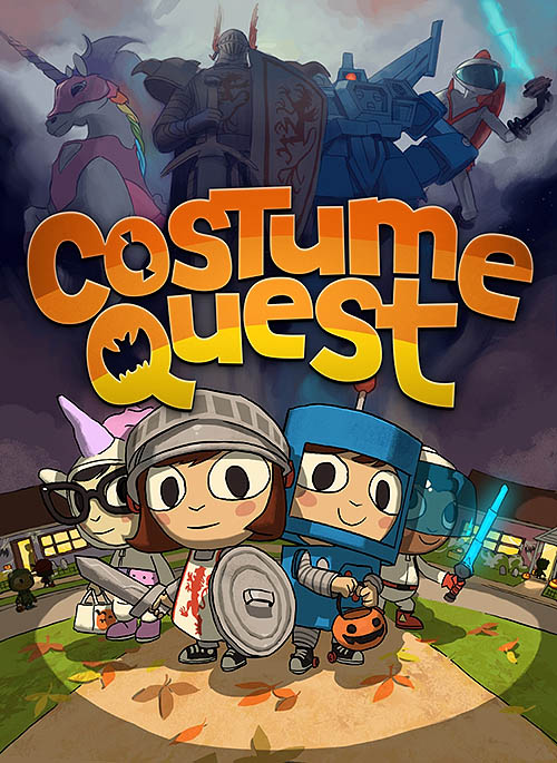
If you or someone you know has never played an RPG-style videogame, I highly recommend DoubleFine’s Costume Quest as the place to start (available on PS3, XBOX 360 and Windows). It’s a really delightful entry into the genre, with a lovely theme, brilliant writing, and it’s also quite short, which is a plus in my book. (via Clare)

Meanwhile, I’d previously linked to Method.ac’s kerning and spline games/competency-assessments. There’s now a fascinating one to do with colour, and by introducing a timing mechanic it’s more game-like than objective assessment-like. Give it a go!

Irresistable Entertainment
Some years ago I remember thinking that technology was just going to get better and better at finding content you’d be interested in, to the point where it would be impossible to drag yourself away from the internet. This compilation video of accidents and unlikely events captured by Russian dashboard-cams is about the closest thing I’ve seen to it, in that it’s 14 minutes long but surprisingly hard to stop watching:

http://www.youtube.com/watch?v=E-l4w-DIiXk#!

Kevin Kelly worries that this kind of thing will normalise extremely unlikely events:

We no longer want mere presentations, we want the best, greatest, the most extraordinary presenters alive, as in TED. We don’t want to watch people playing games, we want to watch the highlights of the highlights, the most amazing moves, catches, runs, shots, and kicks, each one more remarkable and improbable than the other.

I’m not so sure that’s the natural conclusion, since the tastes of both the collective in general and individuals in particular is evidently broader. I’m also not sure it’s that much of a problem either (or at least not much different to the norm), as storytelling through the ages has always concerned itself with unlikely (or even entirely fictional) events.

(Incidentally, Russian dash-cams are also the first noticeable stage in the development of an ubiquitous public surveillance network, which on the one hand enable us to get multiple videos of rarely-filmed events such as meteorites, but on the other hand demonstrate how crowd-sourcing is a convenient way to get over the installation-problem for achieving a 1984-style surveillance state).

Echo Chambers and Filter Bubbles
Another interesting effect of the internet’s ability to show us stuff we like is the danger of ‘echo chambers’ (people only reading the work of those they agree with and passing on links and sentiments from those people) and ‘filter bubbles’ (in which people only follow or get algorithmically shown content that supports their own views, reinforcing confirmation bias). Fortunately a study on Facebook’s data suggests that the echo chamber effect isn’t as bad as we might expect.

Meanwhile this review of the Filter Bubble book on BoingBoing raises the very reasonable counter-argument: “anti-filtering” tools are also developing.

Time Lies
Holly Gramazio of Hide&Seek consistently lies about time in order to make game experiences better. This seems reasonable and useful.

Grand Central train station lies in a similar way, although not by setting their clocks fast as this widely shared article’s headline suggests (which would make people panic and run more), but rather by lying about the real departure time of trains (which is slightly more likely to ease those crucial final seconds of a late boarding attempt).

Of course, both of these effects become weaker when more people know about them. What I’d like is a clock modifier for my mobile which sets the time 1 minute fast most of the time, but on a random, say, 2% of days it instead shows the real time, so I’d know I couldn’t simply factor in that ‘extra’ minute.

T.M. 12/04/13: Richard B adds a local example: “In Heathrow Terminal 5 the information screens in the duty free area lie about the gates opening for boarding in order to control passenger flow and disperse them when the concourse is becoming too crowded.”

Time Lapse
Tsuneaki Hiramatsu took some time lapse photos of Fireflies (with a bit of compositing), which turns out to be just as brilliant an idea as it sounds.

What if you just took a vertical slit of a photo, repeatedly, as something moved past, then composited those pixel-thin images? I’m glad you asked. (A technique along these lines may explain how Rainer Gamsjäger’s video “State of Flux — wave #1″, which baffled me at EIFF 2010, was achieved)

Finally, here’s a different kind of Time Slice by Giuseppe Penone, which incredibly is just what it looks like: an old tree, with parts cut away to reveal its younger self:

Tumblr Tips
Tumblr themes commonly hide the link to the ‘archive’ view, but you can get it just by appending “/archive” to the URL. This is really useful when you want to get a quick overview of a Tumblr’s contents. For example, instead of paging through iheartcatgifs.tumblr.com, you can instead go straight to iheartcatgifs.tumblr.com/archive (and then do something else while you wait for the page to load..!)

Alternatively you can use this tool to automatically identify the top 10 most popular items from a Tumblr by year, based on the number of ‘notes’ (although this can take a little while to process, which is fair enough). For example, you can see the 10 most popular comics from Horse eComics (which are based on a Twitter account that tweets random excerpts from books) here.

Maps: Tube maps, Rearranged cities
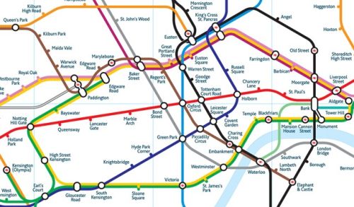
A popular semi-regular feature of Things is alternative tube maps (see the better tube map, to-scale tube map, curvy tube map, and travel-time interactive tube map).  So we might as well just cut to the chase and go straight to this site which excellently curates all manner of tube map variations. (via Sophie)

Meanwhile, in the world of rearranging maps based on non-locational criteria, Odd Things Happen When You Chop Up Cities And Stack Them Sideways.

I’ve sat on this link for far too long – a wonderful Gigapan exploreable photo of London. The distant London Eye, at maximum zoom, reveals the individual people in each capsule. It’s like having super powered vision.

Finally, not enough people seem to know about bird’s-eye-view in Bing maps, which provides a really useful mid-ground between Google’s satellite imagery and streetview. Try it out!

Categories
New

Things 116: Cloud Phase Time-Lapse, 3D Map, Better Tube Map

Video
Point a camera at the sky, create a time lapse video of the clouds. Do the same thing every day of the year. Play back all the videos simultaneously in a grid. Voilà: a kind of phase-diagram visualisation, with seconds representing minutes and space representing seasons. Brilliant.

More detail here. Via Data Pointed.

Link
This is apparently pretty old, and with Google Earth and Street View already taken for granted it’s difficult to appreciate how impressive this is: in-browser 3D maps of major cities by Nokia. A plugin is required, and the sad thing is that I imagine that small barrier is enough to vastly reduce the number of people that will actually try it out.

Picture
Various incarnations of the London tube map regularly feature in Things: in the past I’ve posted about a to-scale tube map, a curvy tube map, and a travel-time interactive tube map.

Unsurprisingly, I rather like Mark Noad’s version, which is an ambitious attempt to make a tube map that is not just interestingly different but actually better than the current canonical version. By retaining the simplicity of design but improving geographic accuracy, I would say it succeeds.

Puzzle
This week, a very first world problem. If voice recognition software fails to understand something you say (e.g. Google voice search, xBox 360 Kinect voice commands, or Siri), what do you do? Having had this happen a few times now, I’m very aware that the natural human response of just saying the same thing but louder might not actually be the best thing to do. (I also imagine my neighbours don’t need to hear me shouting “Xbox go back! Xbox! Go! Back! Xbox go frickin’ back! Fine, don’t then!”)

For example, other approaches to ensure your input is recognised could include: reduce background noise; enunciate more clearly; speak in a monotone; move closer to or further away from the microphone; use a different phrasing; or attempt to put on an American accent.

Which of these is most likely to work? Is there a better approach that I’ve not included here? Is just speaking loudly actually the best approach after all?

Or is the failure rate of voice recognition inevitable and unacceptable in most contexts, and the whole notion flawed from the outset?

@metatim