Data-based movie recommendation
In 2010, with the release of Disney’s The Princess and the Frog, I looked back at the historic trends to try to understand where Disney went wrong in the 00’s. The Princess and the Frog (and Bolt before it) were successful in terms of IMDB and Rotten Tomatoes ratings, but less so in terms of revenue.
I concluded that Disney had to somehow maintain this level of quality in order to build back their reputation. With Tangled, Wreck-it-Ralph, and most recently Frozen, that’s exactly what they’ve done. In fact, since 2011, they’ve consistently outperformed Pixar (despite owning them):

Frozen currently enjoys the highest IMDB rating Disney have received since The Lion King, although due to self-selection it will be somewhat overstated in these initial weeks after its release.
On a more personal note, I’ve now seen Frozen twice, and highly recommend it – do be advised that it is a full-on musical, but co-composed by one of the people behind The Book of Mormon, so there’s a lot to enjoy even if that wouldn’t usually be your cup of tea. It’s also highly notable for having two female leads with real agency (I’m looking at you, Brave, with your arbitrary plot-advancing Will O’ the Wisps).
Video –Automated Automata Architecture
Continuing the Disney-is-actually-pretty-good-now theme, here Disney research demonstrate how they can generate the gearing required to closely recreate an arbitrary cyclical movement, then 3D-print the result to make the automaton. I particularly like the cyber tiger at 3’30”:
(via The Kid Should See This)
Tumblr – Video games with modified objectives
“No wrong way to play” collects examples of people playing video games in ways not intended by the designers. I approve of this.
Tim Link – Learning to Cheat, part 3
Two years ago I surprised myself by betraying someone pretty meanly in a public game. I began a series of blog posts post-rationalising the whole thing within a game-design framework, and after a guilty two-year gap I finally posted my full confession and/or excuse.
Internet decay
If you’ve ever navigated early entries of Things on the blog, you might have seen some dead links, and some links which went dead and got fixed, and some which died again, as I periodically go back and attempt to fight digital entropy.
Based on this insignificant sample, it seems like the half-life for links on the internet is 5-10 years, and considerably less for YouTube videos. This is pretty distressing as laziness/convenience drives us to rely on the internet for files we’re interested in – after all, your options are essentially a) saving a lolcat in downloads>pictures>cats, renaming the file so you can easily find it, and maintaining off-site backups of your data to hedge against hardware failure, or b) just image search “I have a cat and I’m not afraid to use it” from any device, which is a lot more appealing. (Naturally I still choose option a).
There’s a few good links on the subject here, including the compelling quote:
“People are coming to the realization that if nobody saves the Internet, their work will just be gone.” – Alexis Rossi, Internet Archive
Hamster fighting machine / response
Here’s an example of why it’s important to hold onto things on the internet. In 2005, Jarred Purrington made the Hamster Fighting Machine comic/poster (which you can see here or here but not on the original link because it’s dead)
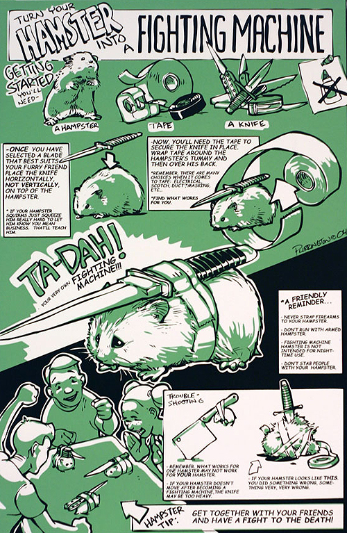
In 2010, Dale Beran (writer of previously-Thinged webcomic/cogent nightmare “A lesson is learned but the damage is irreversible”) posted a lovely response.

Answer – 100 Chalices
Last time I asked if you should choose a chalice with 50/50 odds of being poisoned over one random chalice out of 100 which 100 fiends have each independently and randomly poisoned one of.
Restated, this is asking if you would prefer one-hundred 1-in-100 chances of death vs a single ½ chance. Richard correctly reasoned that the average amount of poison-per-chalice is double in the 100-chalice room, and some degree of bunching in the distribution (i.e. some chalices getting poisoned multiple times) didn’t seem likely to offset it, so the 50/50 chance is probably the best bet.
For any of you not familiar with the probability behind this sort of thing, here’s a quick summary. In the 100-chalice case, calculating all the ways a chalice could get poisoned is very difficult, but calculating the probability of it never getting poisoned is much easier as there’s only one way that can happen. The odds of avoiding poison any one time are 99/100, and this has to be repeated 100 times. So:
Odds of avoiding poisoning = 99/100 x 99/100 x … x 99/100 = (99/100)^100 = 37%. Clearly not as good as the 50% chance in the two-chalice room.
As a post-script, if you’re interested, the expected ‘bunching’ of poisonings would look a bit like this:

This is also a very important concept when evaluating risks in your own life for things that you repeat. For example, I noticed that I tended to step out of the shower in a needlessly risky way, with a risk of slipping (and getting seriously hurt) of perhaps 1-in-a-thousand. That seems tolerable, until you consider that if I showered once a day for 2 years, my odds of avoiding such a fate would be (999/1000)^730 = 48%, in other words I’d be more likely to have at least one such accident than not! So, watch out for that.
Answer – Kickstarter videos
I’ve spoken to a few people about the fact that Kickstarter videos always make me feel less motivated to put my money in. The underlying reason seems to be that a Kickstarter page typically does a great job of selling the product/reward, but the video often ends up being more about selling the people behind it (as being worthy, or in need of your money). Before the video I don’t even think about that; after the video, that’s just another reason to say no.
-Transmission finally ends


